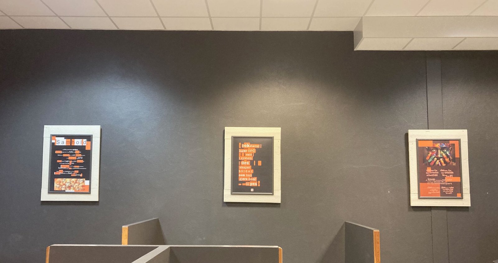
Location: YX Diner / Bistro, Eggedal, Norway.
Format: Serialized typographic expression / 3 pcs. 50×70 cm frames.
Duration: 6 months (extended from an original plan of 4 months).
Mechanisms: Radical creator anonymity, asymmetrical spatial progression, chronological rotations, cryptographic typography.
Spatial Sabotage: The Art of Disrupting the Everyday
Food for Thought (Words after thought) marks the creator’s very first conceptual exhibition in the public space. Where previous works had largely existed in the digital space or between two covers, this exhibition was a deliberate and site-specific intervention into the well-oiled mechanisms of society.
Instead of choosing a sterile, traditional gallery – a white cube where the public’s artistic defense mechanisms are already raised – the exhibition was placed at a busy gas station – a station/diner, where modern people run on autopilot, exclusively to put fuel in the tank and nourishment in the body.
The project stemmed from a philosophical observation: The everyday commercial landscape offers endless nourishment for physical survival and consumption, but leaves a total vacuum for the mind.
By utilizing conceptual text creations (TxTArt), Food for Thought functioned as cognitive speed bumps right in the middle of the everyday routines of completely ordinary people. A raw portion of existential reflection was served where least expected, forcing the recipient out of passive consumption and into active awareness.
The goal was to trigger reflection, whether positively or negatively charged. Food for thought is more than layer cake and Berliners; it is also brown bananas and dry slices of bread.
Spatial Direction: The Strategic Rollout
The exhibition never functioned as passive wall decoration; it was orchestrated as a slow, psychological event across multiple phases, designed to trigger pure curiosity and wonder:
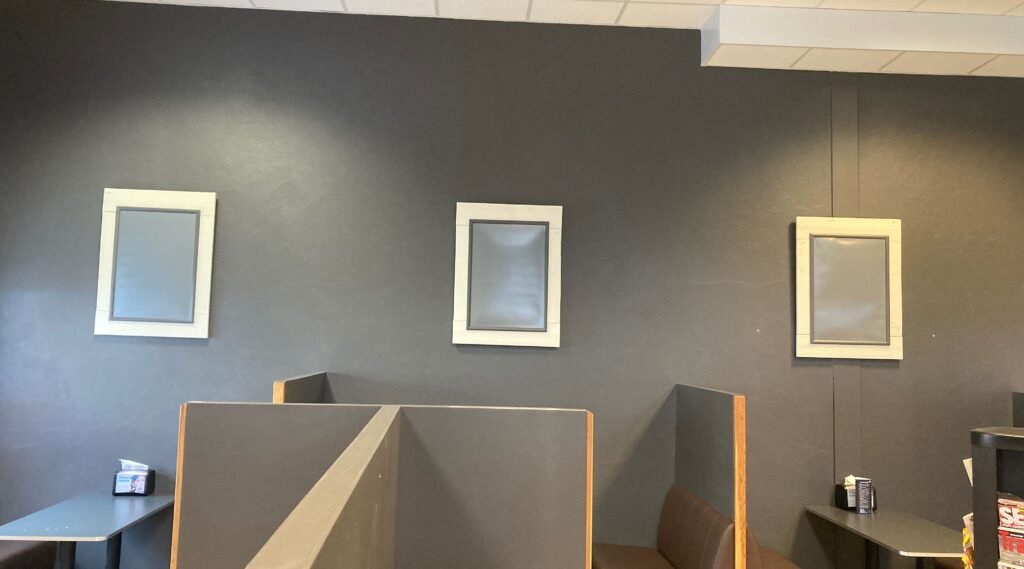
The Vacuum (Phase 1):
The exhibition started by breaking the expectations of the surroundings. Three heavy, white-painted, self-produced frames with mounted clip frames, similar to those used for advertising posters, were mounted on a dark charcoal-gray wall and left completely empty for several days.
This created a visual absence that forced regular guests to relate to an inexplicable void.
The Asymmetrical Activation (Phase 2):
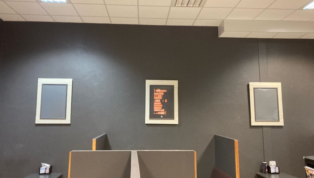
Without any form of traditional opening, a single poster was silently mounted in the middle frame overnight.
Flanked by two empty frames, the mystery was amplified, and the viewer’s gaze was inevitably drawn toward the isolated text.
The Complete Triptych (Phase 3):
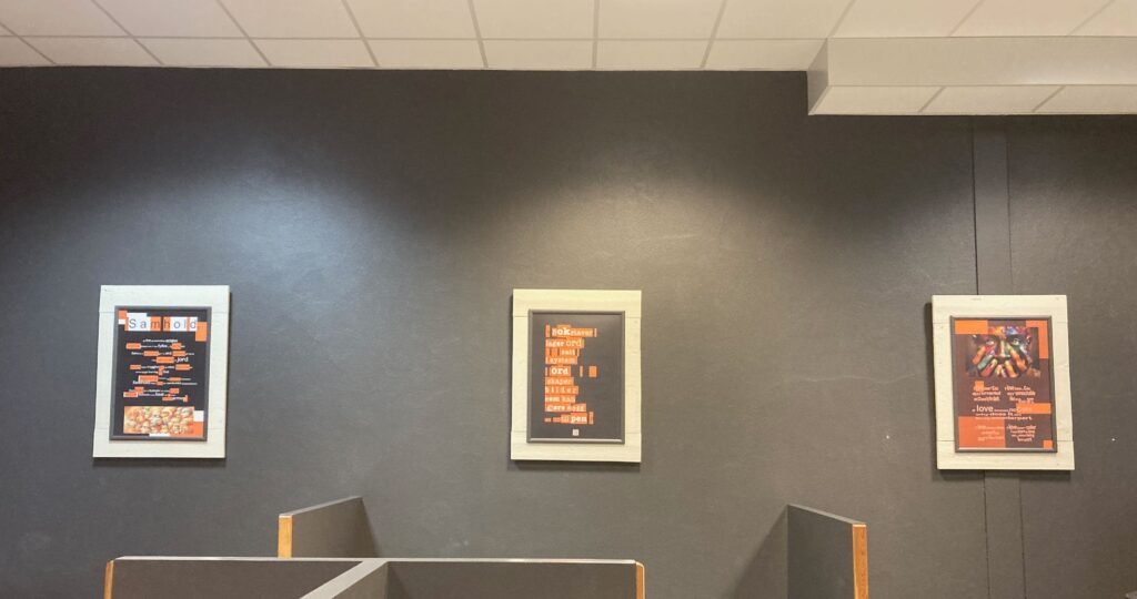
A few days later, the last two frames were filled.
Thus, the interwoven, three-part structure was complete – a living framework that would rotate dynamically over half a year.
The Four Rotations (Mind Shifts)
The structural backbone of the exhibition consisted of four distinct rotations, which together comprised a collection of 12 original TxTArt posters.
The texts were characterized by an intense and uncompromising tone, forged during a long period of deep, existential isolation many years earlier. There, the polite facades of society were peeled away to map the naked raw material of human sovereignty.
FRAME 1: LEFT — FRAME 2: MIDDLE — FRAME 3: RIGHT
First Mind Shift: The Mechanics of Perception (Posters 1–3)
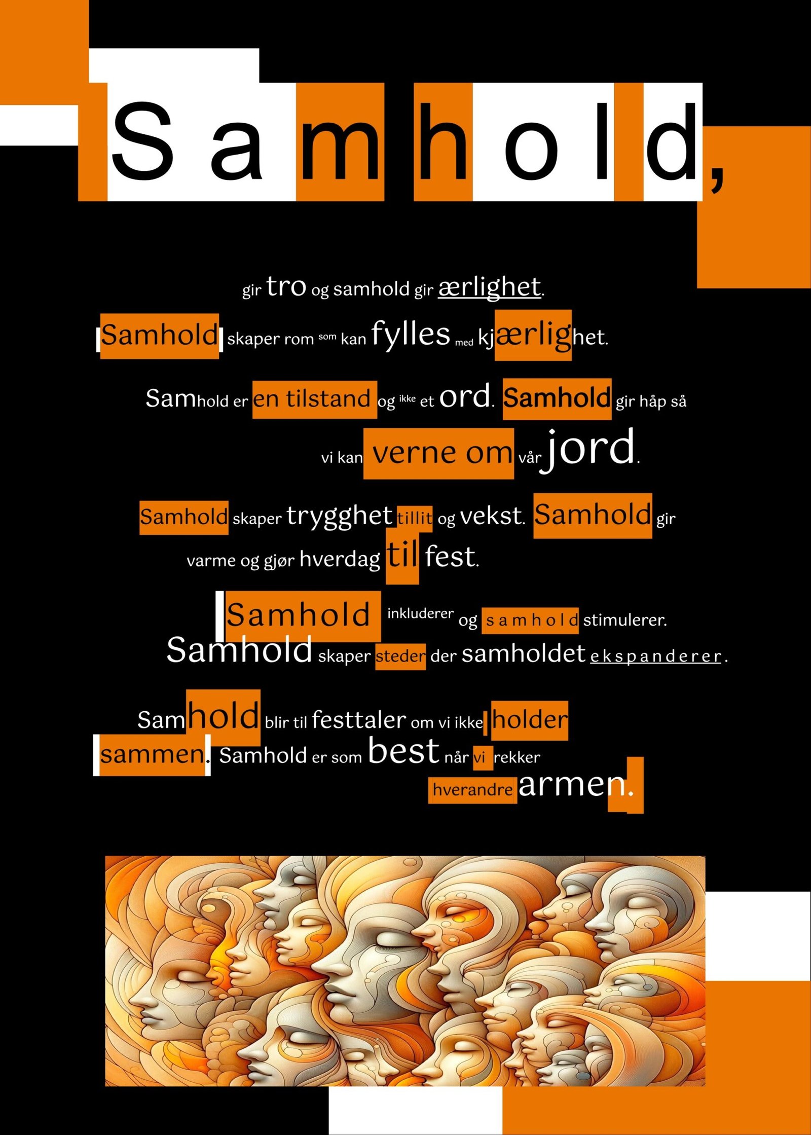
Left flank (Unity): A deep dive into the collective human corpus. Unity is not defined as a hollow ceremonial speech, but as a living, active state, visually anchored in an organic web of stylized faces.
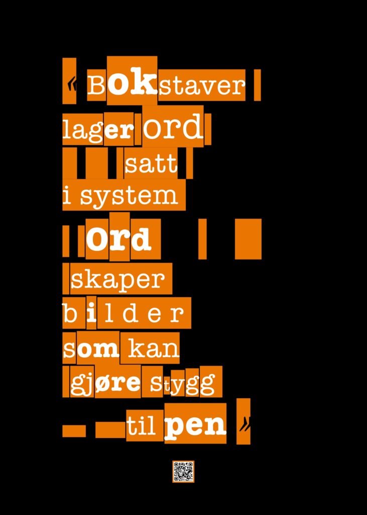
Middle monolith (Letters make words): The conceptual hearth. Stripped of illustrations, the poster’s text exposes the very core of the exhibition: Letters make words put into a system. Words create images that can make ugly into beautiful. It explains to the viewer exactly what is happening in their own head in real time.
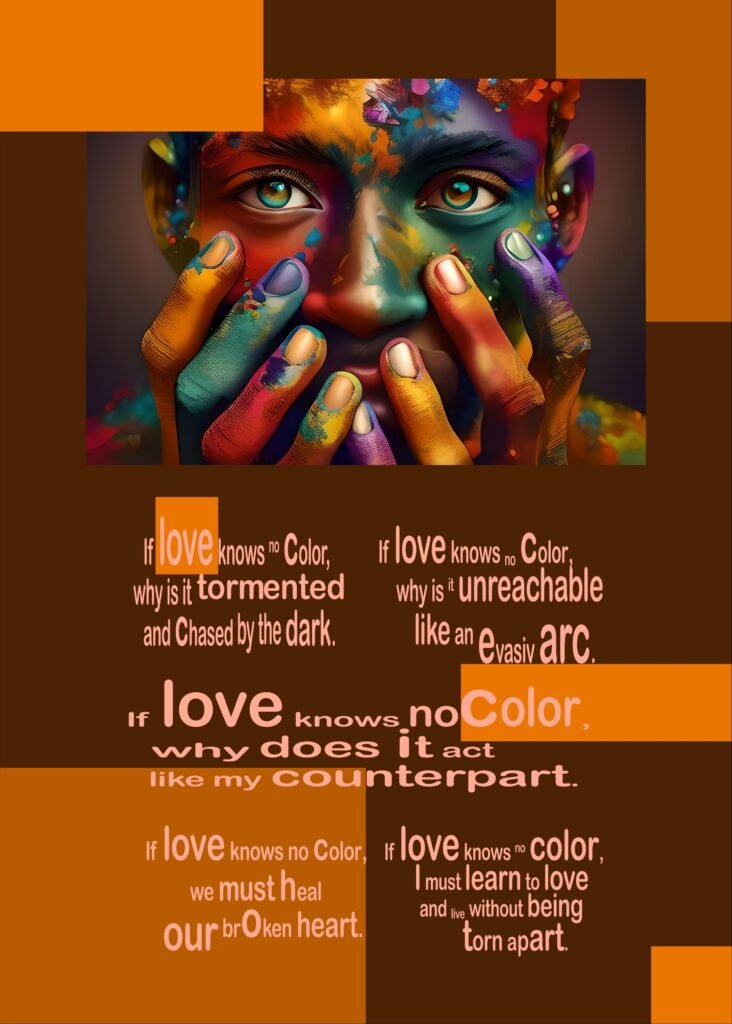
Right flank (If Love Knows No Colour): Shifts the linguistic frequency into an intense, English-language, and poetic scrutiny. The text is contrasted by a saturated, multicolored portrait that explores the individual mind’s vulnerability in the face of contradictions.
Second Mind Shift: The Syntax of the Ego (Posters 4–6)
This rotation utilized a clean, white aesthetic expression. The purpose was to act as a visual shock – a “flashbang” against the dark background wall – an unmistakable signal to the regular guests that the landscape had changed. By distributing massive single words across the wall, the ego’s habitual hierarchy was deliberately broken.
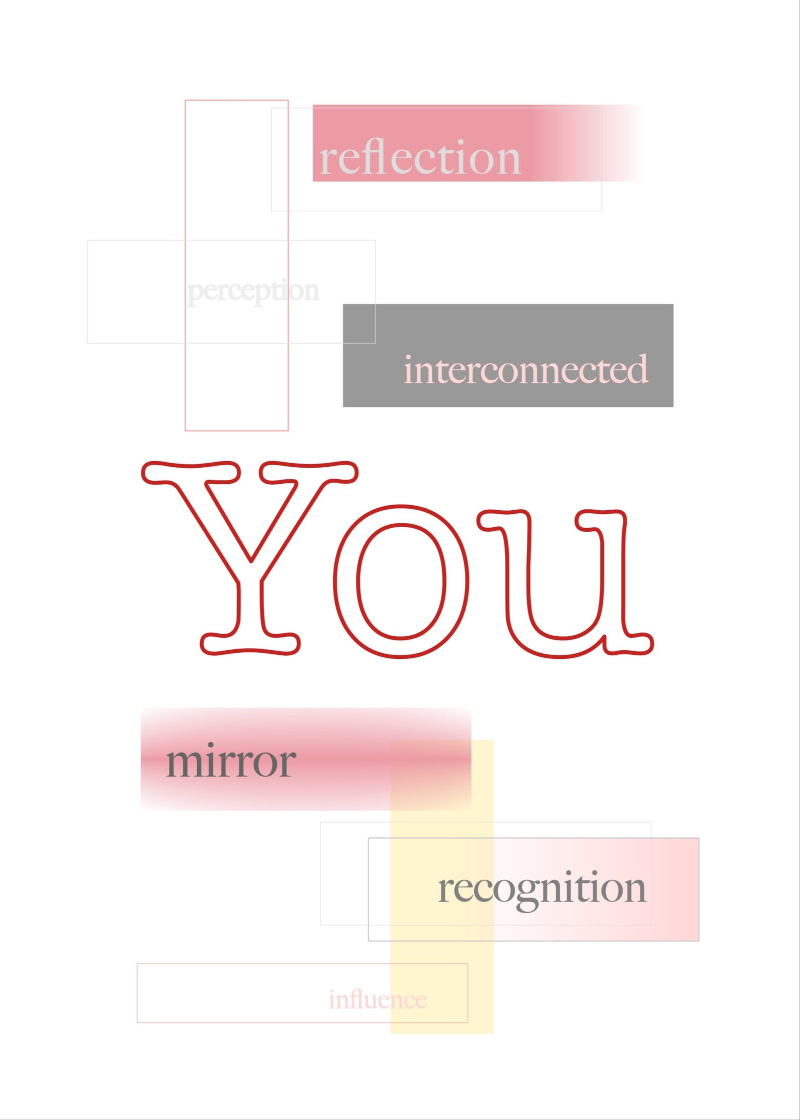
Left flank (YOU): The first link in the new syntax. The viewer was forced to process and acknowledge the other human being before anything else.
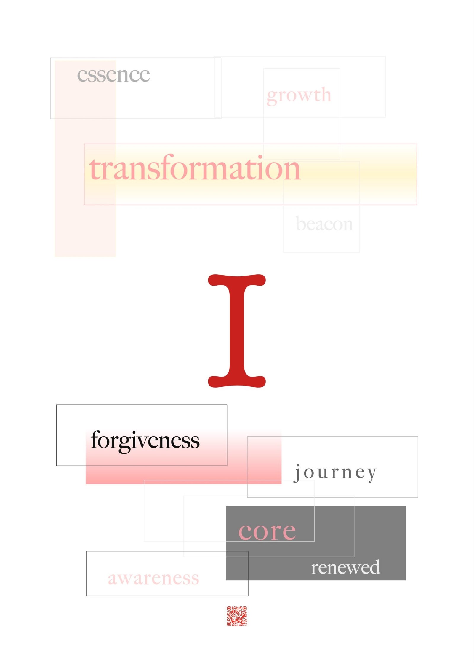
Middle monolith (I): The declaration of the self. The placement demanded that one had first digested “You” before being allowed to direct focus toward oneself.
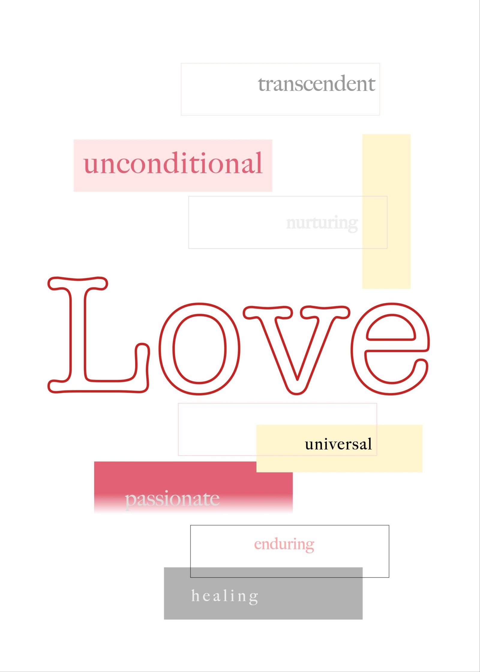
Right flank (LOVE): The conclusion of the broken sentence structure. Collectively, the three frames functioned as a pure deconstruction of how we mechanically frame love.
Third Mind Shift: The Hearth of Sovereignty (Posters 7–9)
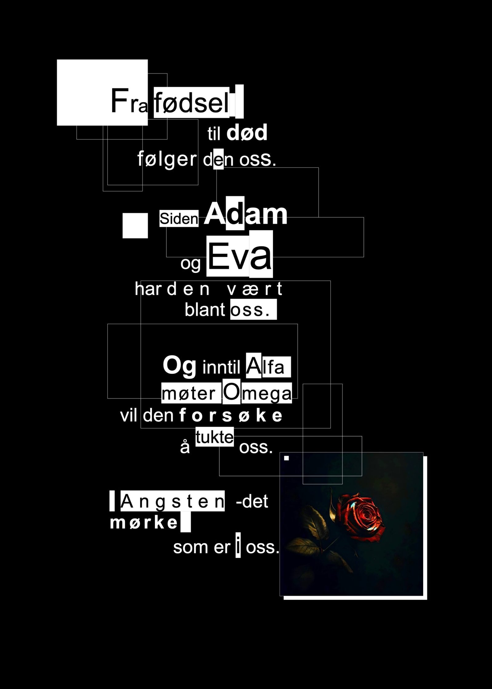
Left flank (The Anxiety): A condensed, complex critique of dogmatic control mechanisms that attempt to discipline human vulnerability from birth to death. The text is locked inside rigid, geometric boxes, but is contrasted by a single red rose – the heart under siege.
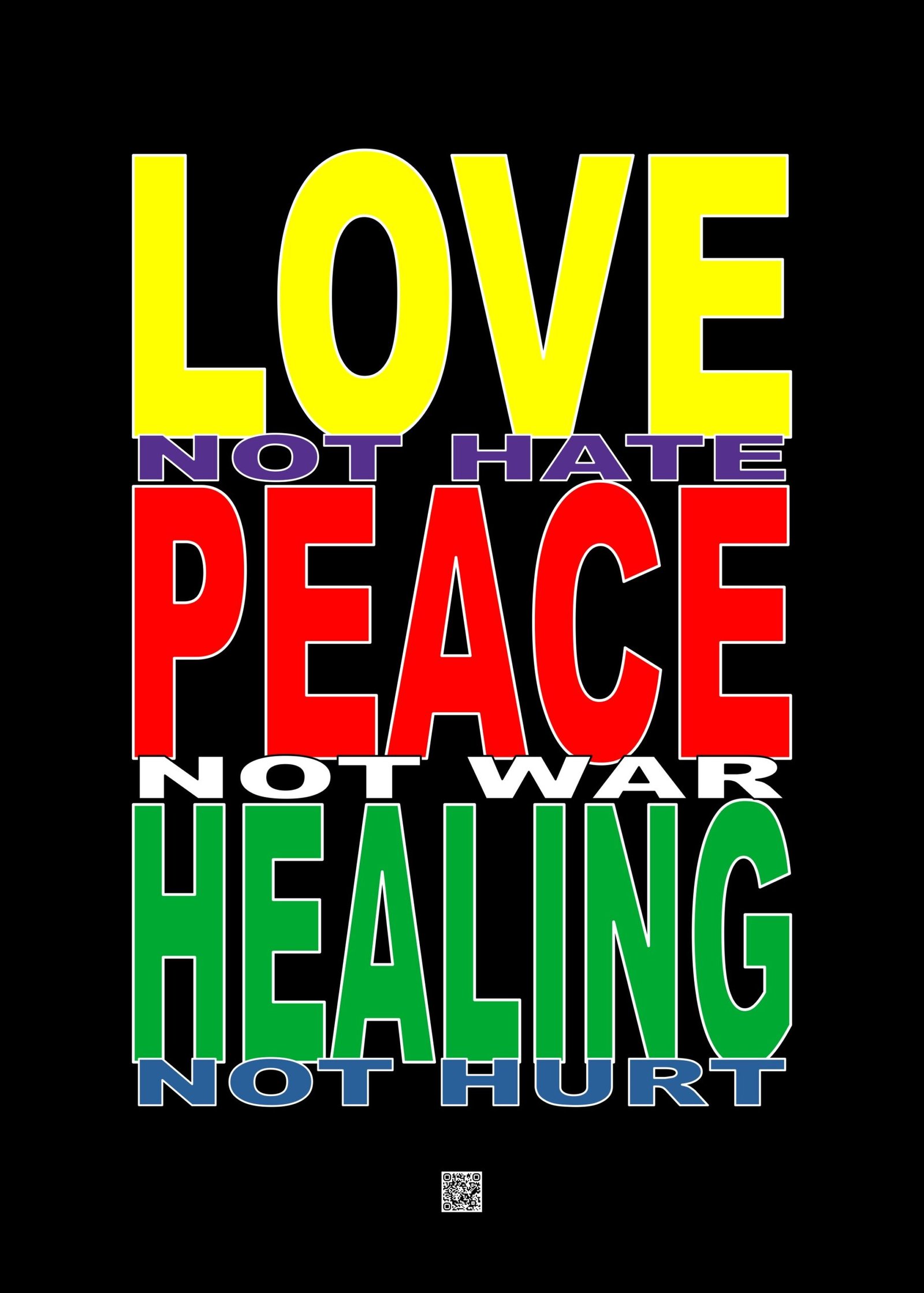
Middle monolith (Love, Peace, Healing): A universally accessible, brightly colored portal. With a direct and immediate palette, it functioned as an uncomplicated sanctuary in the middle of the wall.
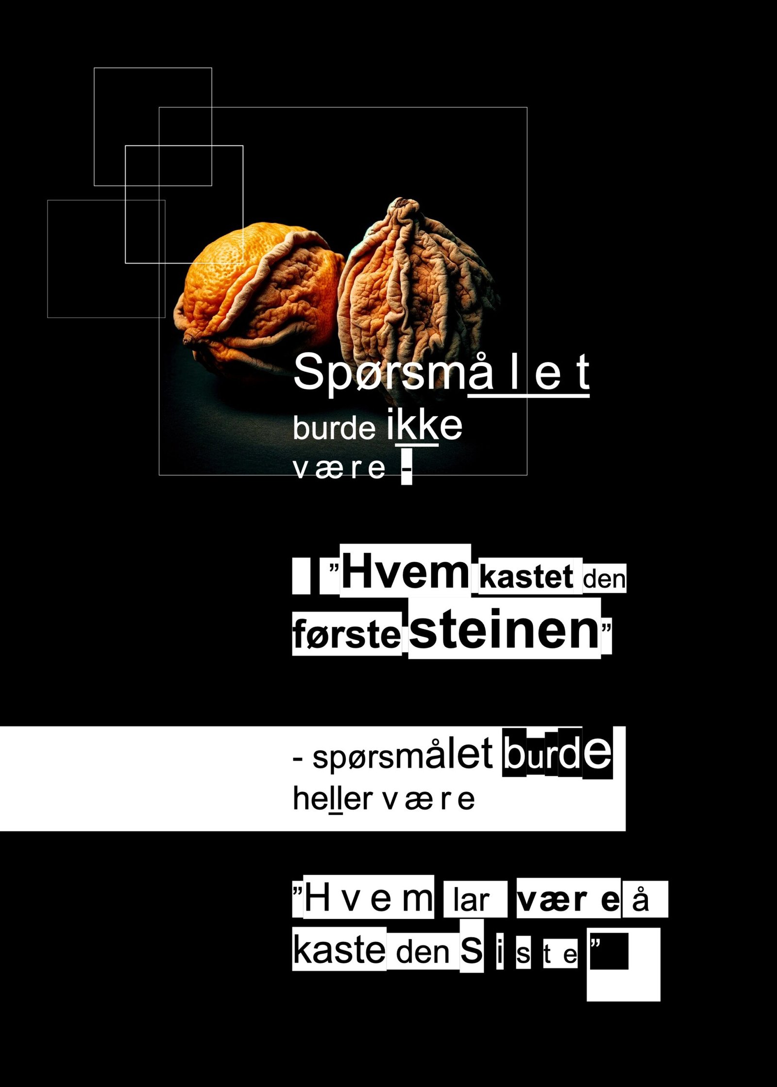
Right flank (The Last Stone): A philosophical master key to radical, personal accountability. Here, the classic question of guilt (“Who cast the first stone?”) is brutally turned upside down to demand a deeper realization: “Who refrains from casting the last?” The ultimate declaration of breaking destructive patterns through absolute self-restraint.
Fourth Mind Shift: The Inner Horizon (Posters 10–12)
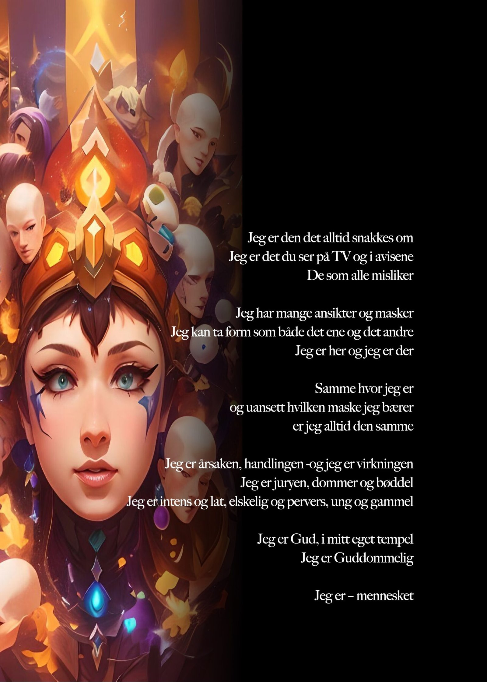
Left flank (I Am – the human): An uncompromising manifestation of human sovereignty (“I am the cause, the action – and I am the effect”). The poster utilized a vibrant and modern visual expression, deliberately designed to catch the eye and challenge the younger generation.
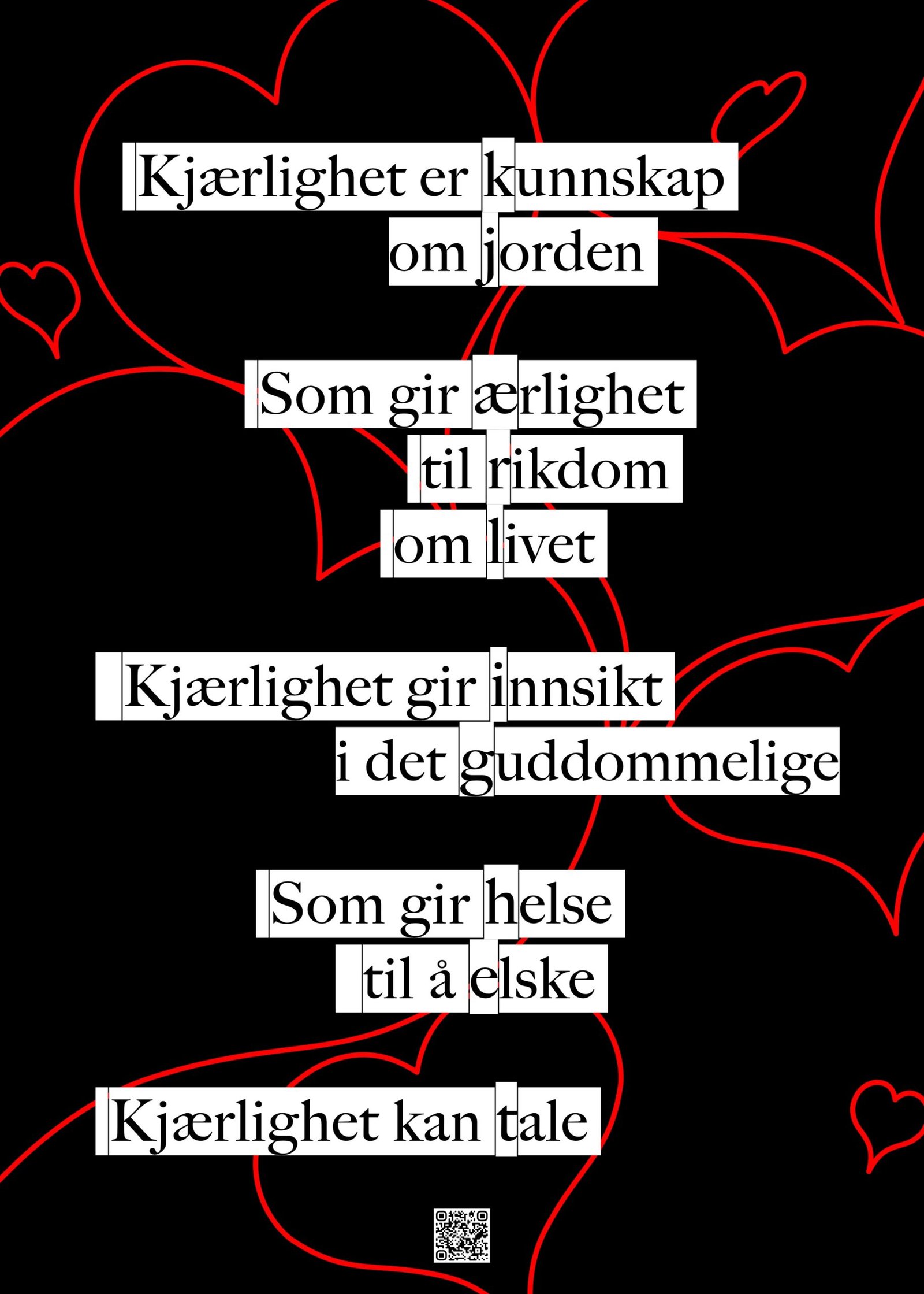
Middle monolith (Love): A naked layout that redefines love from being a passive emotion to becoming an active, structural intelligence.
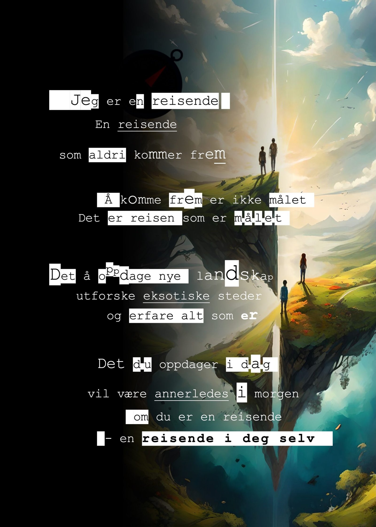
Right flank (Traveler): The exhibition’s final point of departure. It reminds the viewer that the deepest exploration never has a fixed final destination: “…a traveler within yourself.”
Cryptography and Conceptual Remixing
The Eggedal exhibition went deeper than purely visual layout; it also concealed a geometric coding system in the typography itself. In Poster 11 (Love), the creator built in a flawless vertical acrostic.
By reading the first letter of the last word on each line from top to bottom, the text systematically spells the word K-J-Æ-R-L-I-G-H-E-T (L-O-V-E). This technique demonstrated the core component of the poster in practice: That love is an intricate matrix built up of individual, universal forces (Knowledge, Earth, Honesty, Insight, etc.). If you remove a single pillar, the entire linguistic and philosophical system falls apart.
When the originally planned four-month period was over, the exhibition entered an experimental extension that stretched towards half a year. In this phase, the creator began to “remix” the collection’s content; posters from different rotations were put together in entirely new configurations to observe how changes in the linguistic context mutated the guests’ automatic thought patterns.
Radical Anonymity as an Artistic Shield
To preserve the conceptual exhibition’s absolute freedom to speak for itself, an uncompromising demand for total creator anonymity was set during the exhibition’s active period.
The creator regularly spent time at YX Eggedal as an ordinary guest, and isolated their own name and existence in order to remain an invisible observer of their own experiment.
By severing the connection between the artist’s identity and the wall, the public was deprived of the opportunity to judge the content based on a personality. The words were forced to carry their own weight, functioning as masterless, objective mirrors for whoever sat down beneath them.
The Legacy of Eggedal
The original intention to let the project transition into a broader, local “People’s Gallery” – where the frames would be handed over to new amateur creators to spark a lasting creative uplift in the village – ultimately ran aground due to external logistics and a far too busy everyday life for the station’s operators.
Nevertheless, Food for Thought remains an undeniable success and a pure conceptual intervention. The true validation never came from established art critics, but through the cognitive friction the work created in everyday life.
When guests exasperatedly remarked to the staff that the panels in rotation 2 were hanging in the wrong order — “It’s not You I Love, it’s I Love You” — they simultaneously confirmed that the premise of the design worked.
The syntax had succeeded in breaking through the dulling autopilot of the everyday. It forced the human as a mechanism to stop, actively reprogram understandings within their own mind, and participate in the construction of meaning.
The creator did not receive many comments via the staff, but this comment validated the exhibition; people had to think, and what hung on the wall was noticed and created friction.
This conceptual intervention at YX Eggedal remains the definitive foundation for the creator’s visual and philosophical timeline.
It proved once and for all that profound, transformative creation does not require elitist institutions; it only requires truth, spatial precision, and the courage to meet the ordinary human being exactly where they stand.